
CARP Project InDesign Skateboard Poster Design 1
Here is my first design attempt for the Skateboarding CARP Poster,
it makes use of proximity to create a clear visual hierarchy, with relevant and similar
information being grouped together and aligned, to make it structured and the
text and key information easy to read. I also attempted
to implement colour contrast between the brighter, white text, and the darker
black text, which helps to create a vibrant and visually pleasing
design. This is balanced out through the use of a purple outline
which is complementary of the black background, creating an aesthetically pleasing use
of colour.
However, the design is not dynamic enough, as it is too structured and doesn't feature
enough visually interesting graphical elements, or feature an interesting use of text.
This creates a clean design but one that isn't visually interesting or chaotic
enough for the theme of skateboarding, which is fast based and dynamic.
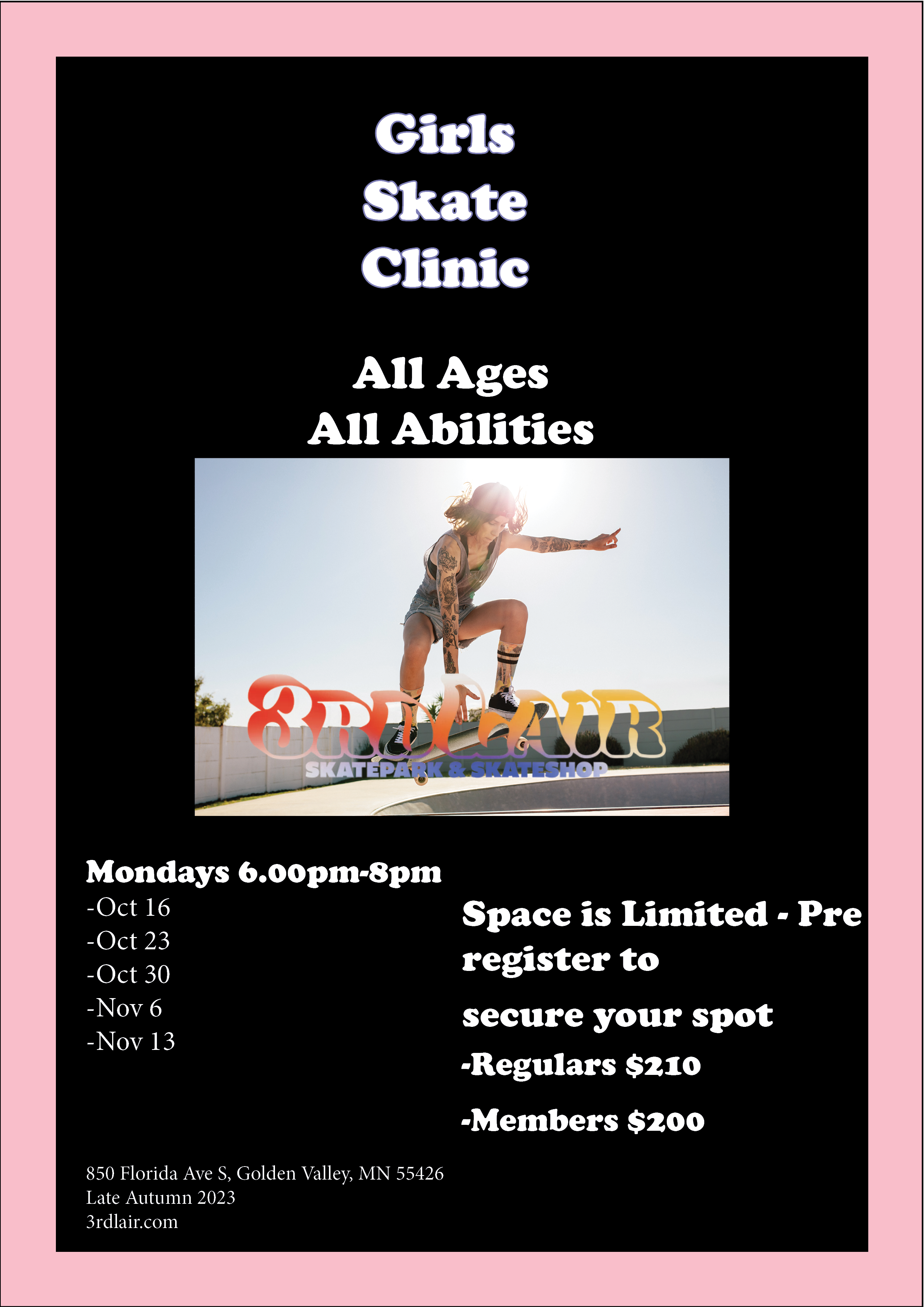
CARP Project InDesign Skateboard Poster Design 2
Here is my second design attempt for the Skateboarding CARP Poster, it similarly to my first design
makes use of proximity to create clear visual hierarchy between similar information.
This can be seen through the Title, key image and key information being
centred, creating a neat, clean and visually interesting design. I also made use
of colour contrast again with the bright white text contrasting well with the darker black
background, this time with a pink outline to complement the black. I attempted to add more dynamic
and visually interesting graphical elements to this design with the company poster being aligned directly
under the image of a lady skateboarding, making it look like she is reaching out and touching
the logo, which did add some much needed dynamism to the design.
However, the text is still too structured and orderly, which didn't fit with
the fast paced and chaotic nature of skateboarding.
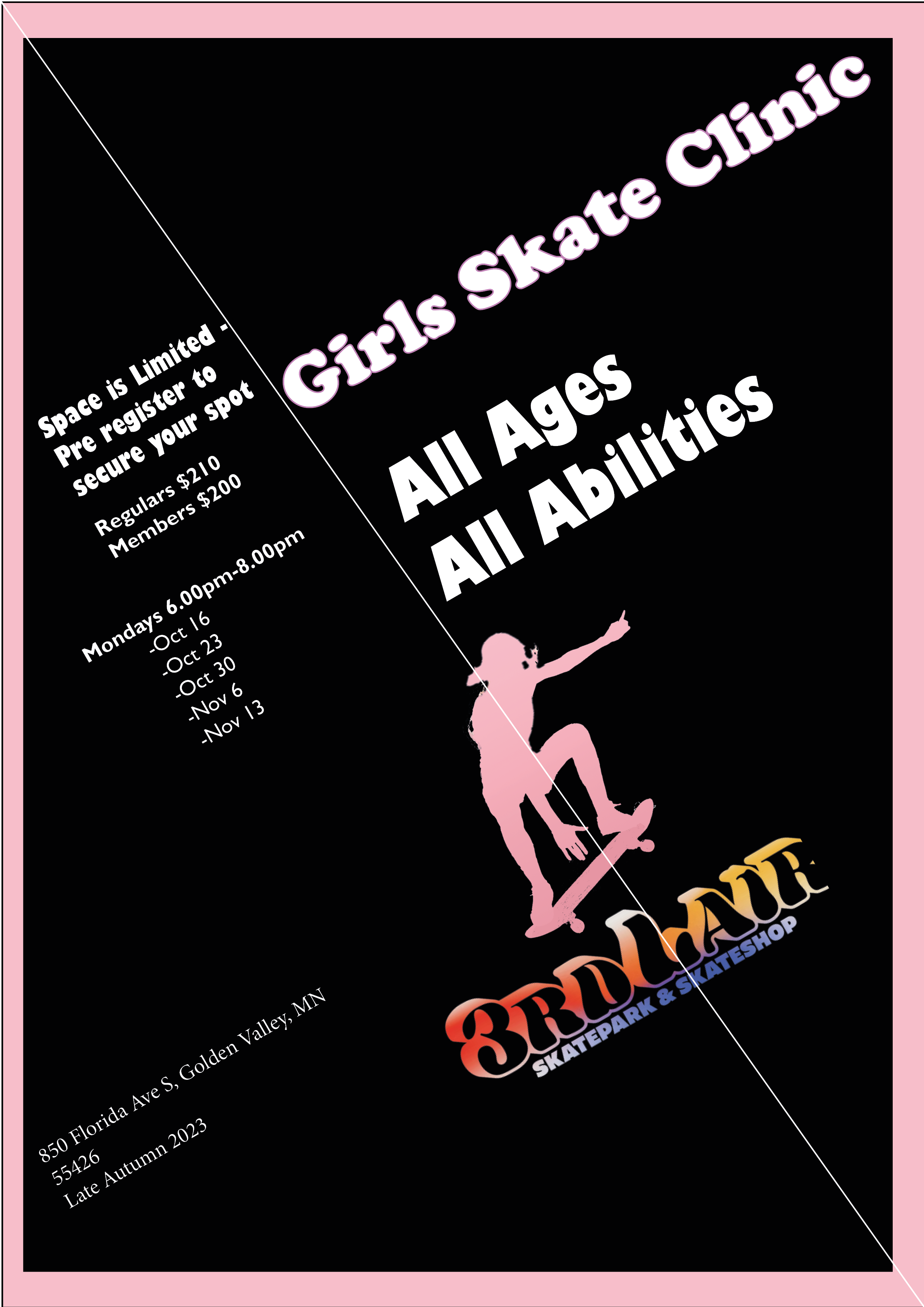
CARP Project InDesign Skateboard Poster Design 3- Final Design
Here is my third and final design attempt for the Skateboarding Carp Poster, while it
is similar to my previous two designs in some aspects such as the use of
brighter white text on a darker background to create effective colour contrast
with a pink outline to complement the black, it is far more visually interesting and dynamic
as it utilises the text far more to create a design that evokes fun and
adrenalin, something that skateboarding is renowned for. This is as the
text utilises the axial typographic system
and is diagonally aligned along a white line, with interesting graphical elements such
as the image of a girl skateboarding, highlighted in pink,
breaking across this axial design to demonstrate the chaotic nature of skateboarding
and emphasising the skateboarding focus with the company logo and the image
being the standout elements of the poster.